
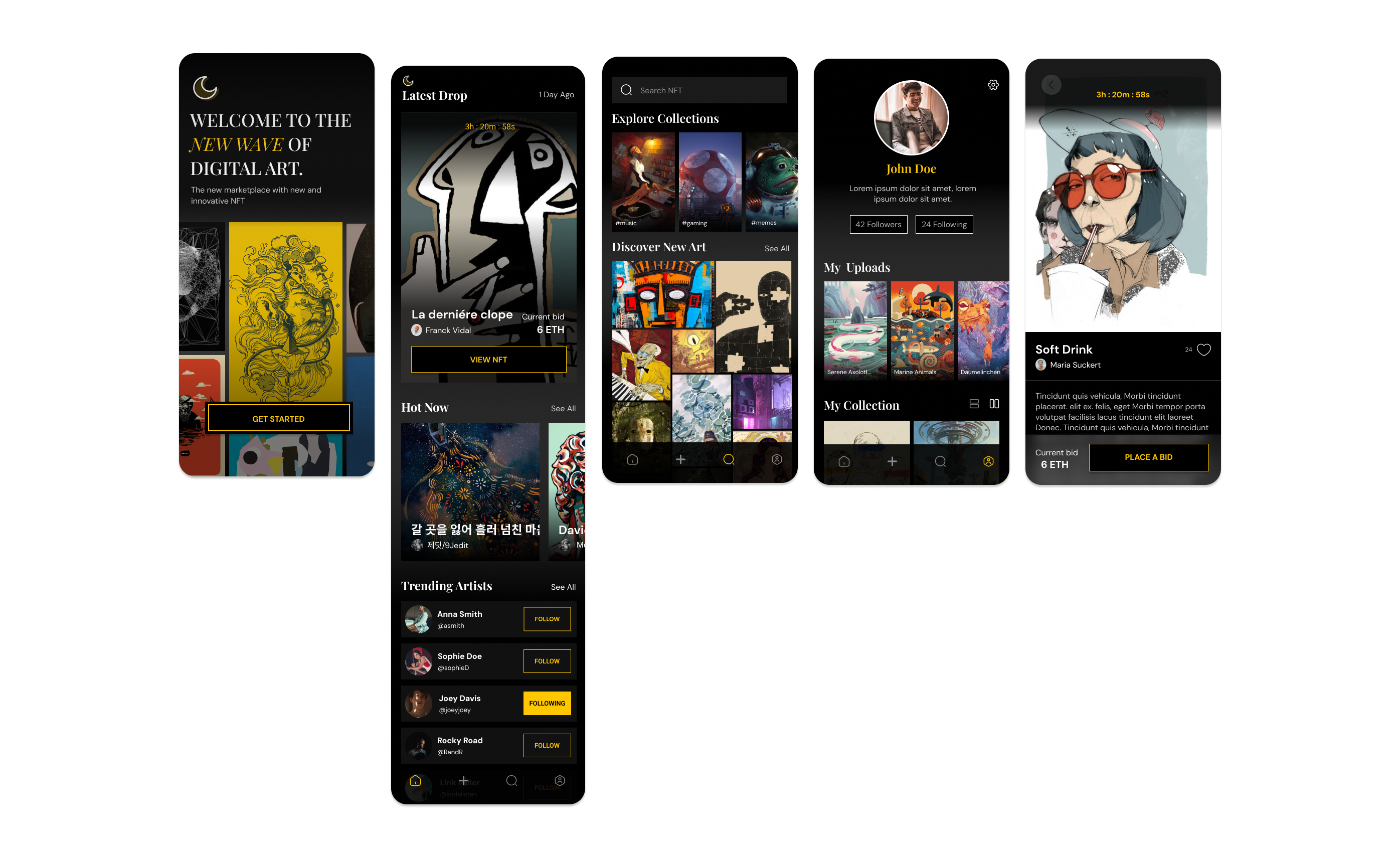
Logo redesign for a family-owned construction company, aimed at creating a unified and professional brand identity. Inspired by industry leaders like DeWalt and CAT, the final design balances boldness with clarity. This project also included a full brand guideline, with upcoming extensions into web and apparel design.
View Case Study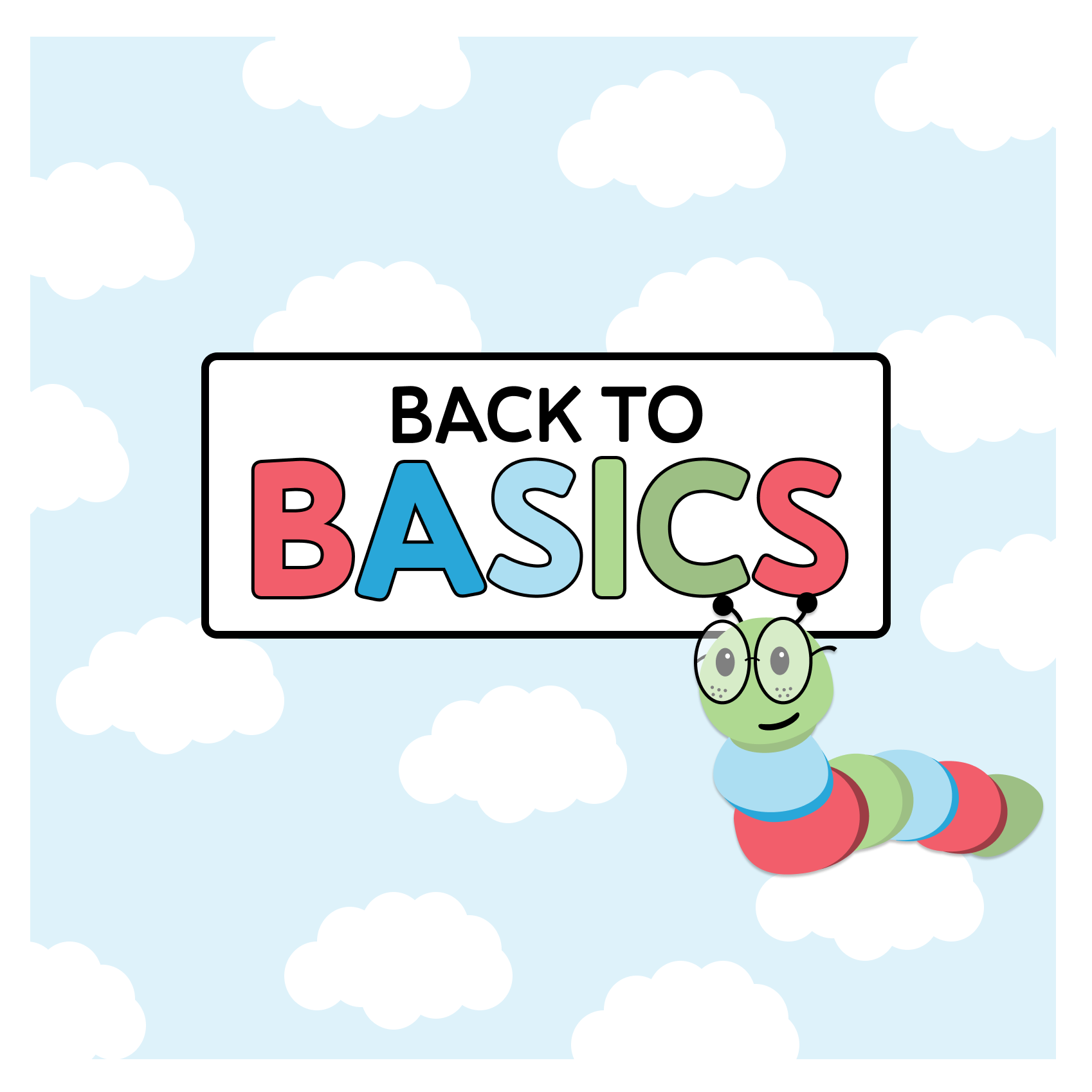
With an emphasis on research, the project explored the roots of literacy decline and the impact of shifting teaching methods. Created under a tight four-week timeline, the final design bridges traditional instruction with digital tools to support K–3 readers. Includes in-depth research, wireframes, and a high-fidelity prototype—completed while balancing two jobs.
View Case Study
A collection of three projects that showcase my growth as a designer—from my very first steps in Figma to more advanced, end-to-end design challenges. Each case study highlights a different stage in my journey, from foundational UI work to research-driven problem solving and rapid prototyping. Together, they reflect how I’ve built my skills, developed my process, and learned to balance creativity with usability.
View Case StudyHi! I’m a musician and music teacher transitioning into the world of design. My background in music has given me a deep appreciation for rhythm, composition, and storytelling—elements I now apply to visual design.
I come from a creative background that blends design with hands-on experience working with people. Before transitioning into design, I taught in the classroom and ran my own private piano studio, which gave me a strong foundation in communication and collaboration. I’ve also worked as a barista and in customer service, where I learned to problem-solve in real time and connect with people from all walks of life. These experiences continue to inform how I approach design and build thoughtful, functional work.
Outside of design, I love spending time outdoors, hanging out with friends, snowboarding in the winter, being with family, and occasionally indulging in a good comedy show—those are the things that keep me grounded and inspired.
I specialize in digital media, layout, and user experience, focusing on creating compelling and functional designs. My experience primarily comes from school projects, but I’m eager to grow, refine my skills, and bring creative ideas to life.


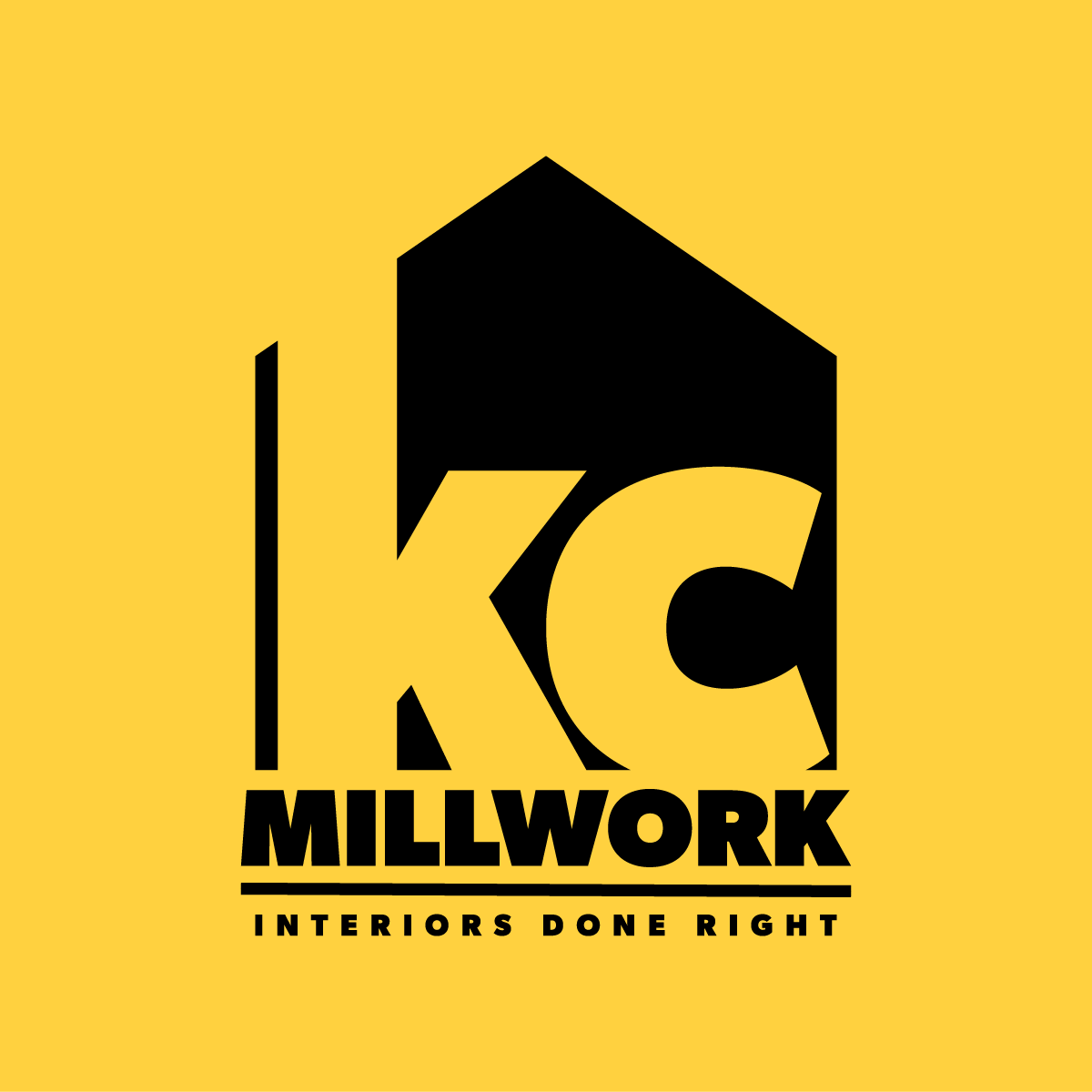
This project was a logo redesign for a family-owned construction company with whom I have a personal connection. Their previous logo had been used inconsistently across platforms, with variations in typography and color that diluted their brand presence. I offered to redesign their logo to help create a unified, professional identity that would feel both classic and memorable, aligning with their reputation for quality craftsmanship and longstanding community trust.

I began the redesign process with a sketching brain dump in my journal, letting ideas flow freely to get concepts out of my head and into something tangible. At the same time, I researched different types of logos, studying how construction companies and adjacent industries approached their visual identities. I gathered inspiration online using platforms like Pinterest and paid close attention to logos in my local area, observing how designers incorporated stylistic techniques such as geometric shapes, strong typography, and classic color palettes to communicate reliability and professionalism.
This initial sketching phase helped me generate a wide range of directions before narrowing down concepts that felt aligned with the company’s goals of appearing classic and memorable. From there, I digitized select sketches and began refining the designs further in Illustrator. After the narrowing down several ideas that were more concrete, I sent over a PDF with various rough drafts for the company to look through. Each idea included a small blurb about what it was trying to convey.
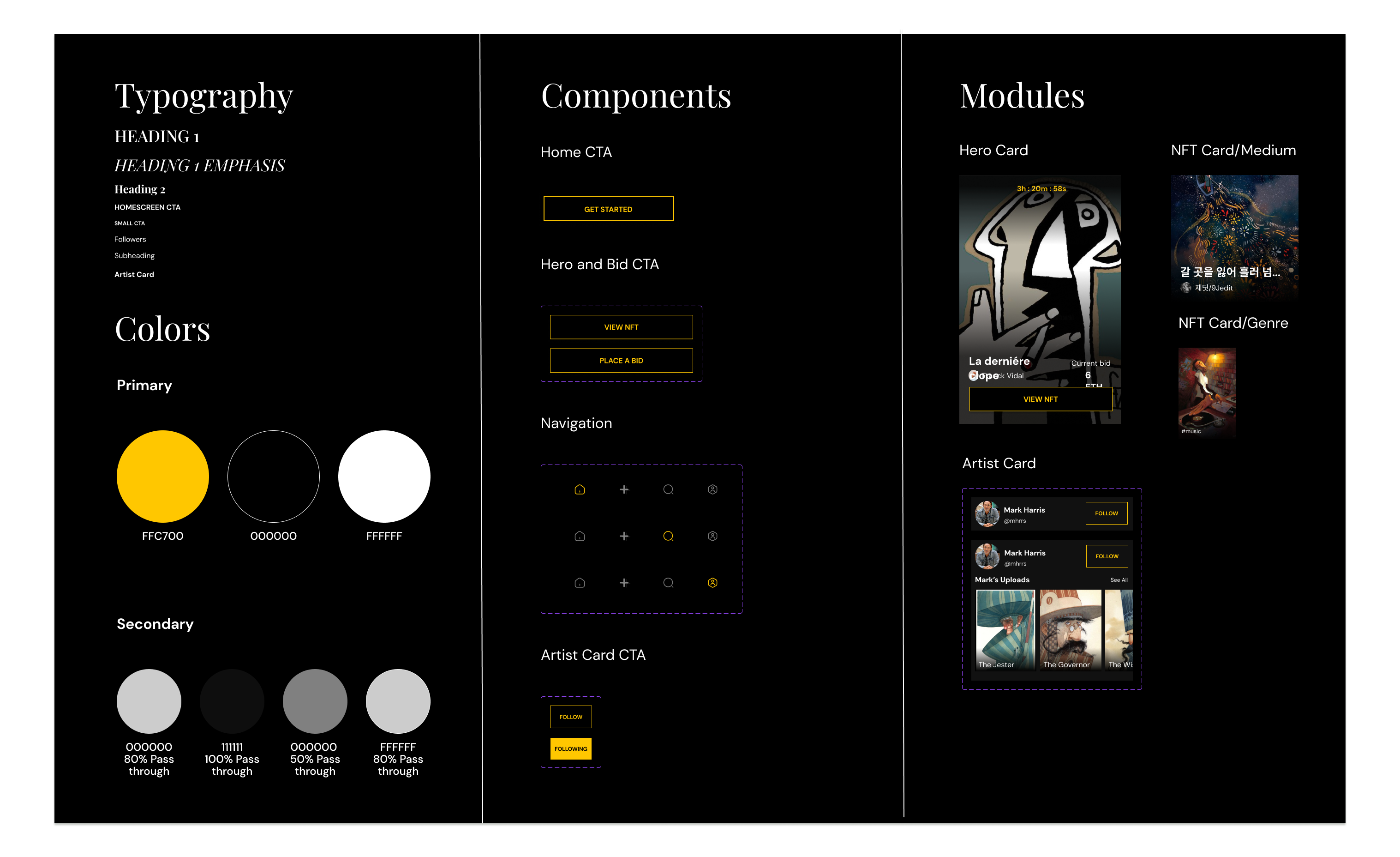
After sending out my initial rough ideas, the company chose concept number six as a starting point to refine further. Their feedback included specific aspects they liked as well as preferences for adjustments, which gave me clear direction for the next iteration. We scheduled a FaceTime session where I shared updated concepts and explored options together in real time. Through this collaborative process, we were able to completely narrow down the final look. I then solidified a brand guideline package for them, which included the finalized primary logo, wordmark, sublogo, color palette, and typography to ensure consistent application across all their platforms and materials moving forward.
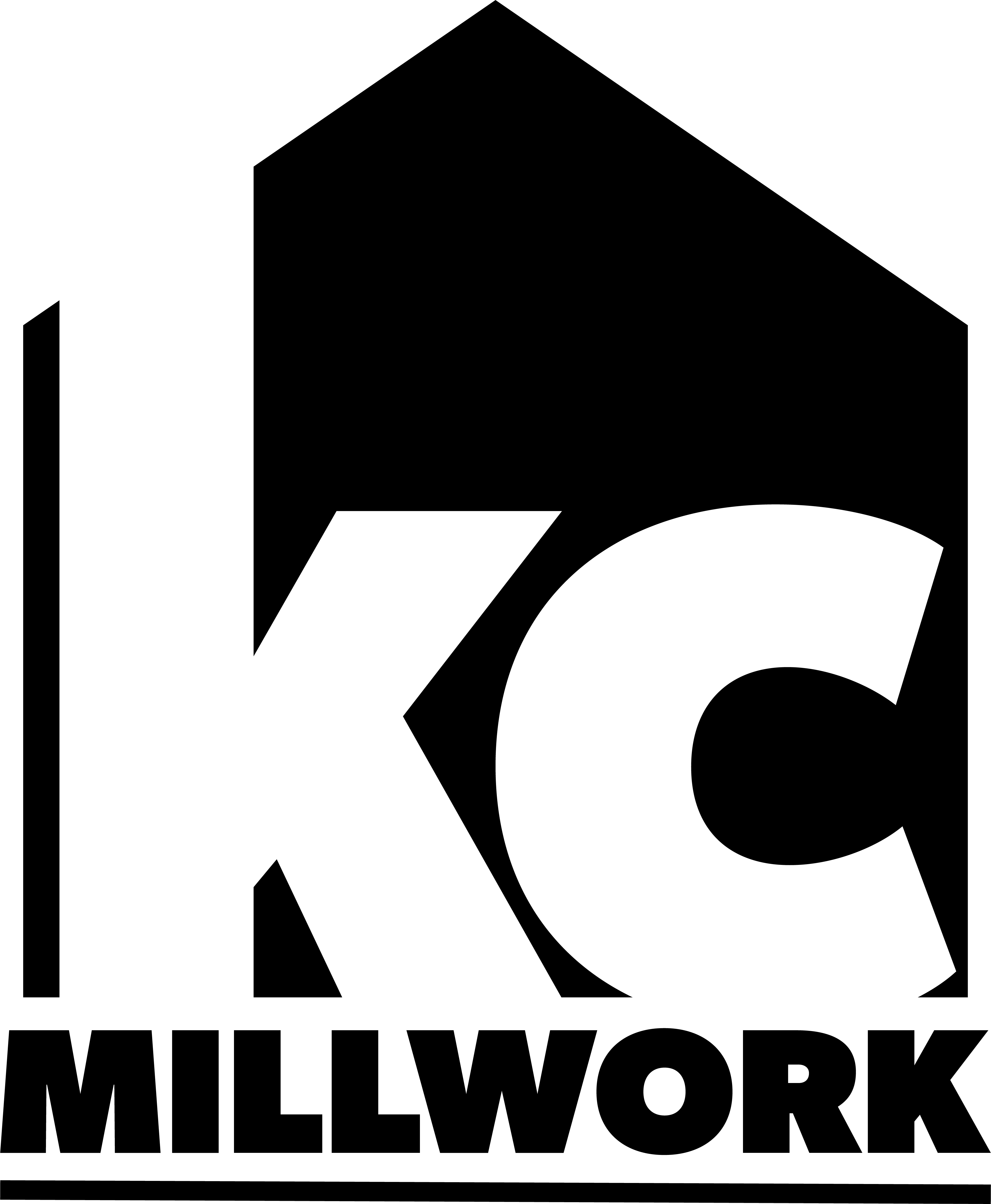
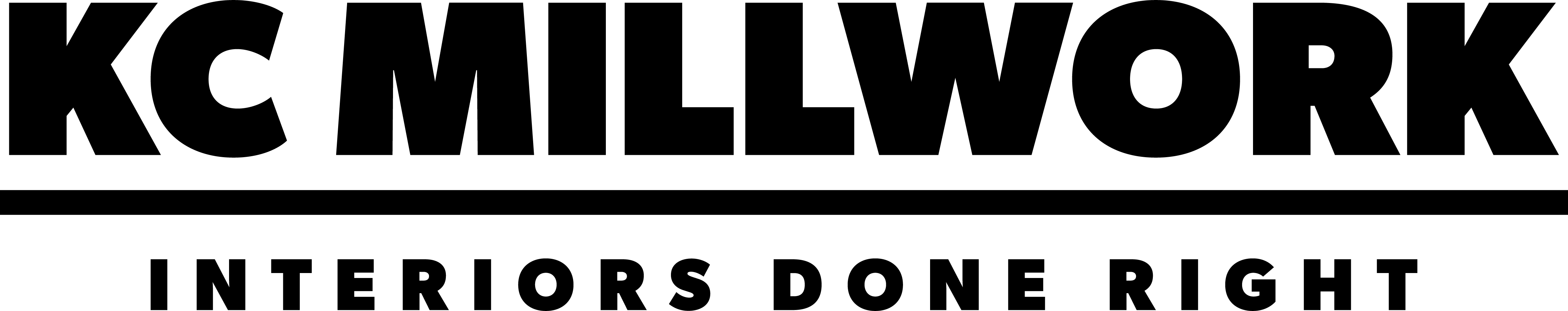
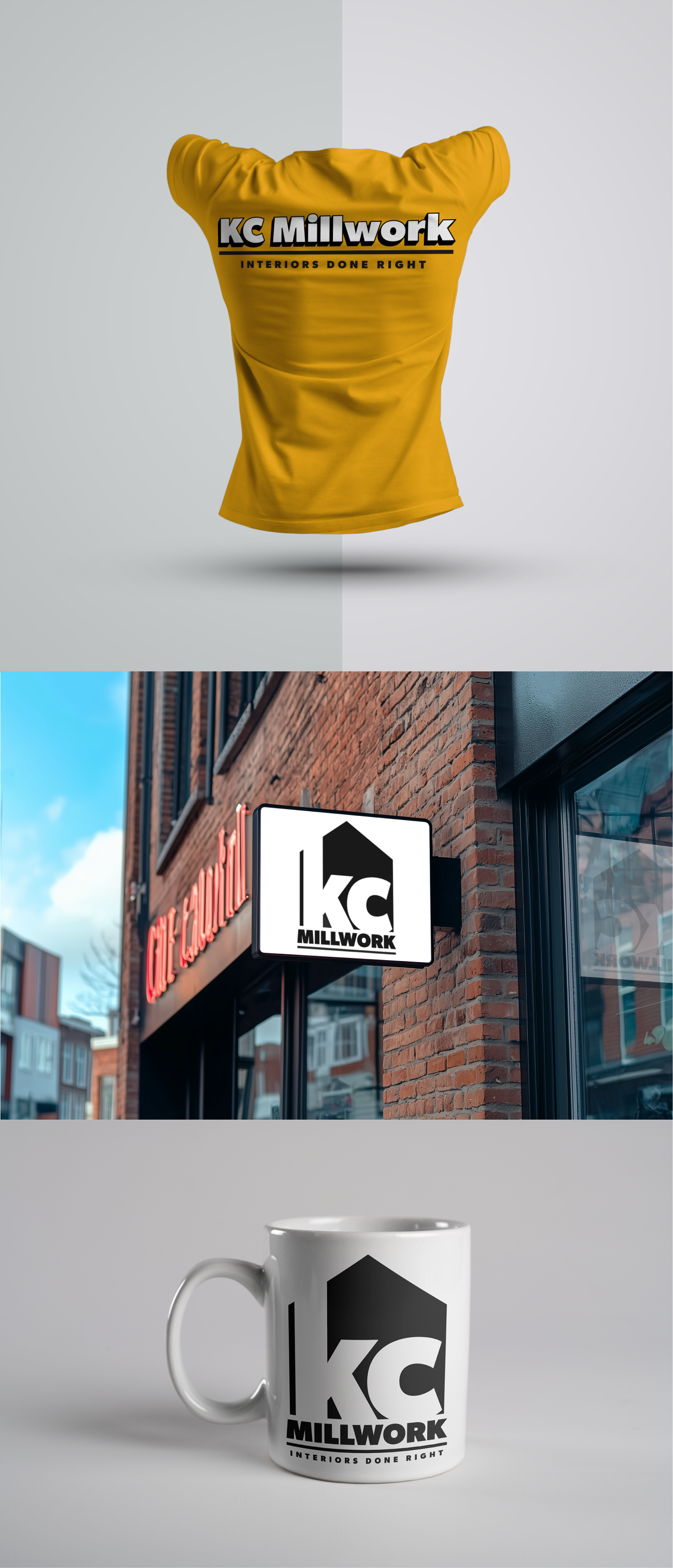
The final product drew inspiration from well-known construction brands like DeWalt, Milwaukee, CAT, and Lowe’s, incorporating strong, bold typography and clear, recognizable shapes to communicate trust and durability. With the new brand identity in place, our next steps will include redesigning the company website to reflect their updated logo and style, as well as creating a branded summer work shirt for the team. These additions will further strengthen their professional presence both online and on job sites.
Creating a cohesive brand image was a completely new experience for me, and it became an invaluable learning process—especially in learning to lay aside my own preferences and ideas at times to focus on what resonated most with the client. This project strengthened my ability to balance design expertise with client collaboration to produce a final product that truly served their goals.
For my capstone project, I designed a mobile app focused on supporting early literacy development in young readers. The goal was to create a tool that not only engages children but also empowers caregivers and educators with meaningful insights. Drawing on research in human-centered design and educational best practices, the project focused on accessibility, intuitive navigation, and playful interaction to make reading both fun and effective.
To kick off my capstone, I had to pitch three problem ideas with criteria, problem statements, and working titles. I chose topics I had personal experience with—practical, meaningful stuff that could do some good. I ended up diving into the growing rates of illiteracy in the U.S.—a topic that stuck with me after watching a YouTube essay by an English professor. The more I looked into it, the more it resonated, especially given my background working with K–3 students in reading-focused classrooms.
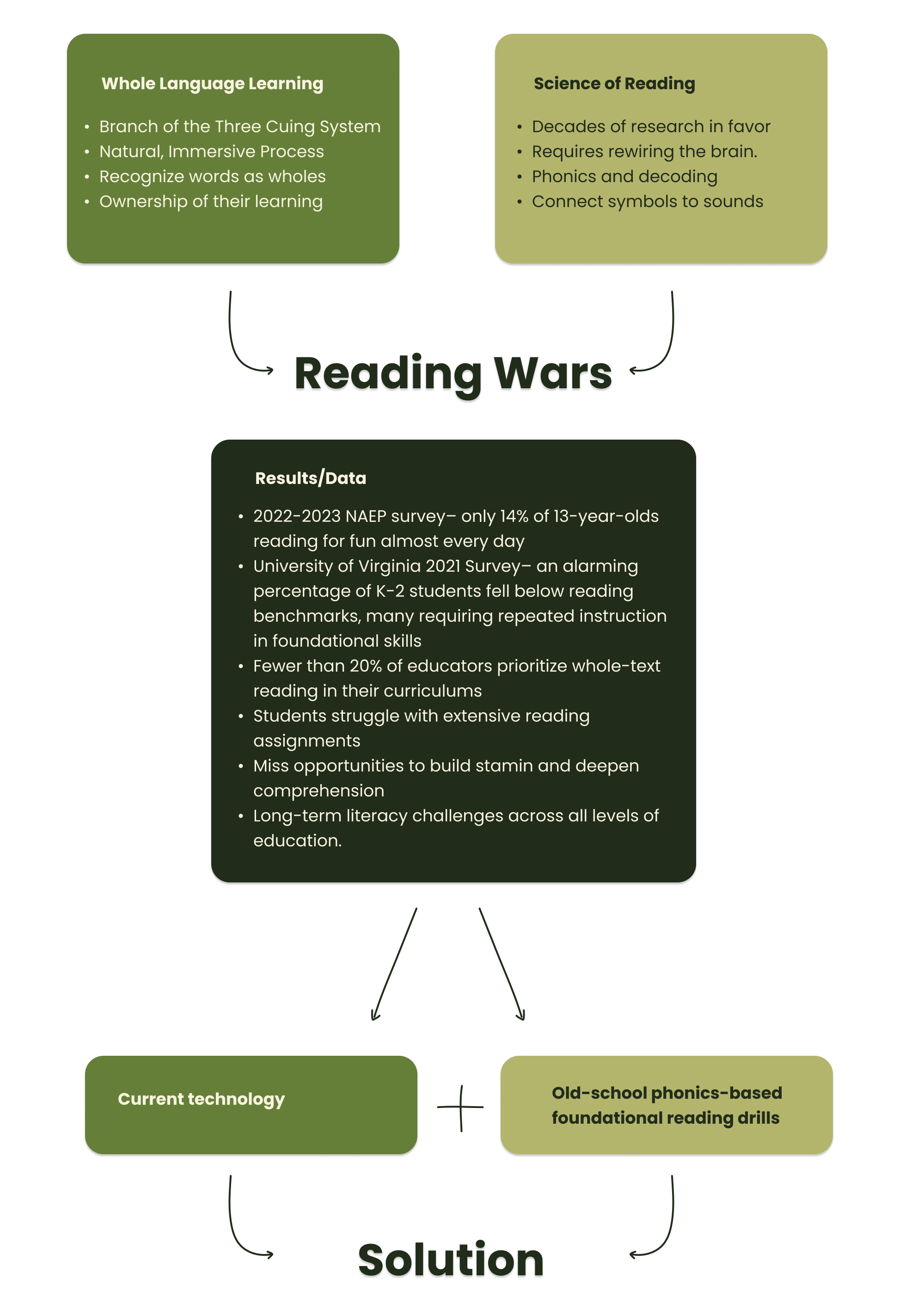
As part of my research, I put together a 20-page report and literature review that uncovered a strong link between early reading strategies and long-term literacy. A shift in the early 2000s from phonics to whole-language instruction seemed to impact how kids learn to read—but both methods have their pros and cons. That led me to design a classroom resource that leans into phonics-based learning while gamifying the process. With tech becoming a bigger part of classrooms, I wanted to create something that blends traditional methods with digital tools in a way that feels natural and supportive.
The majority of my time on this project was spent researching and writing the report, so when it came to wireframing and prototyping, I had to move quickly.
To start, I analyzed existing phonics platforms, games, and traditional paper-based learning strategies to get a sense of how I wanted to structure my design. I sketched out ideas in my notebook to explore different layouts before creating a low-fidelity wireframe in Figma.
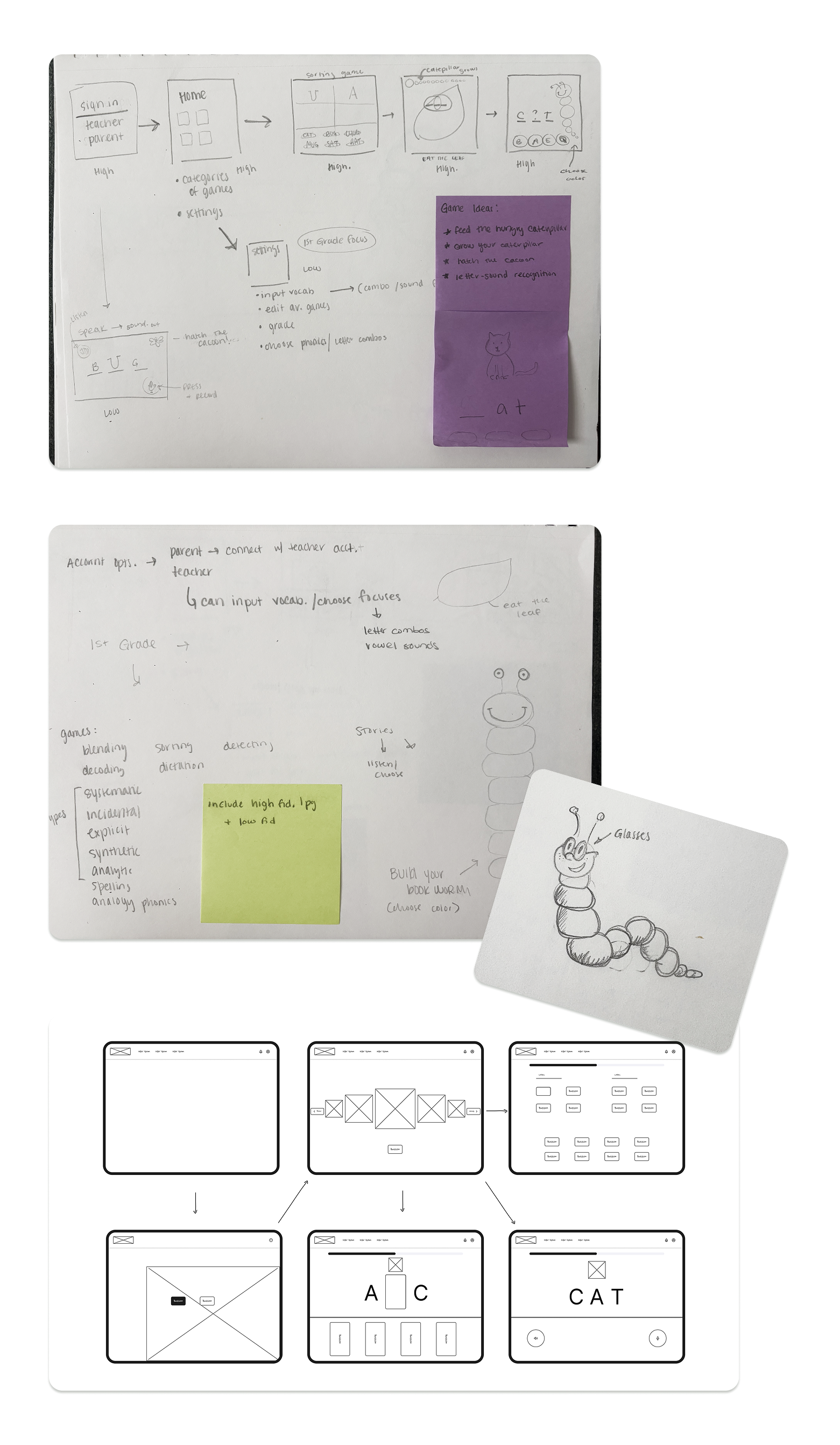
Once I had my low-fidelity wireframe complete, I scoured the web and Pinterest for UI inspiration. I wanted the style to be fun and playful without feeling overstimulating for young students. I created a moodboard and sketched out some rough ideas for the mascot, ultimately choosing a caterpillar or worm to play off the traditional idea of a bookworm.
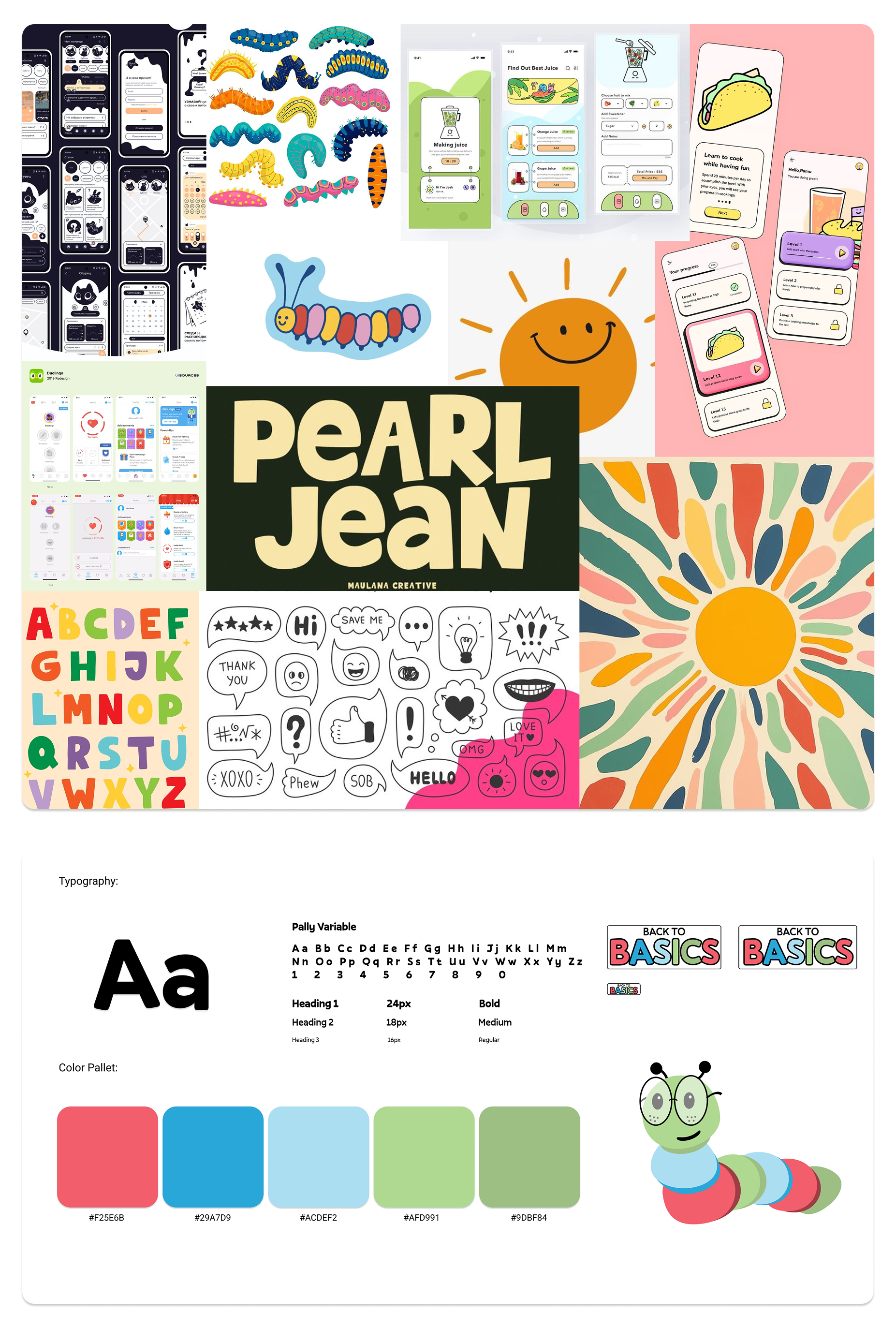
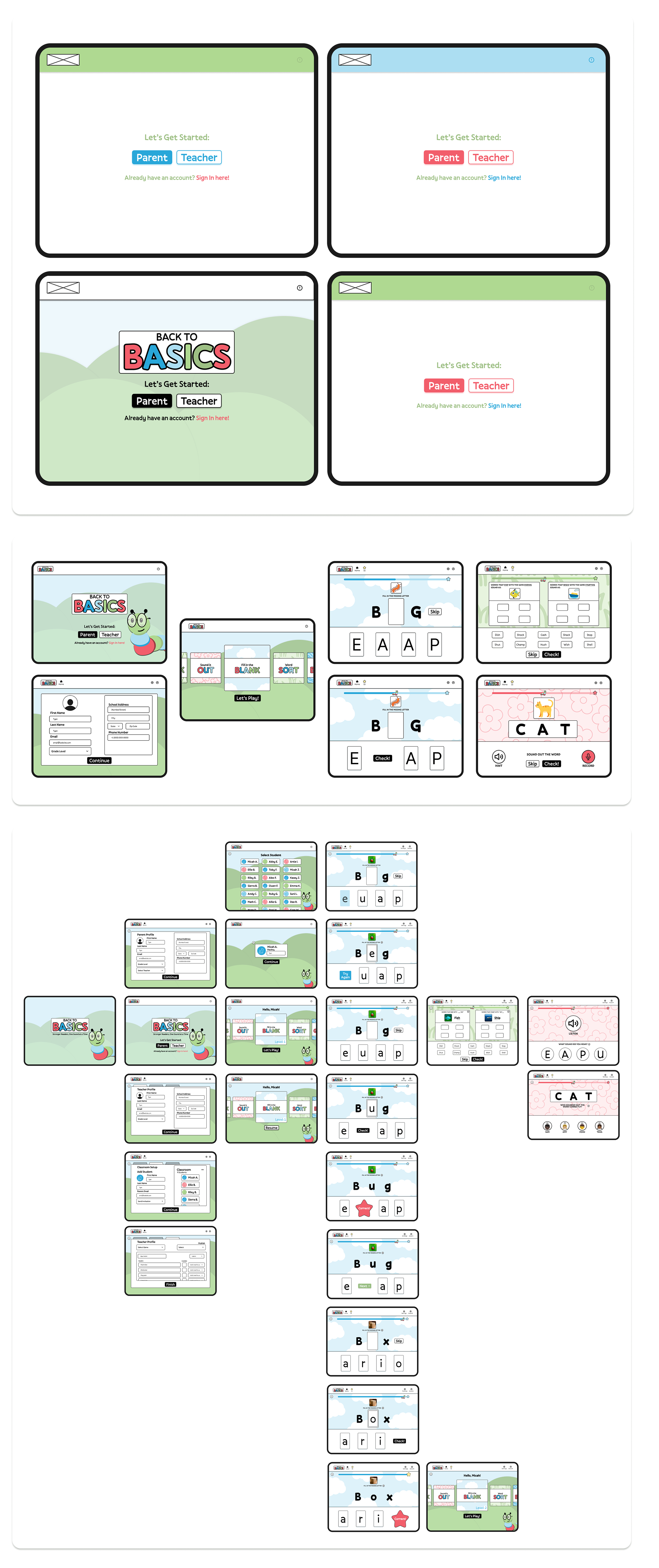
Finally, I put together a style guide and incorporated it into a high-fidelity design in Figma. I added elements like placing letter blocks into designated areas, a trajectory tracker, and a rough concept for rewards when students answered correctly. My final prototype included interactive, animated features that are ready to be used for testing.
For the testing portion of my project, I used Google Forms to create a simple, easy-to-share questionnaire for participants. I gathered feedback by reaching out to fellow teachers and parents of young students. The responses highlighted issues with wording and directions, practical privacy concerns, and potential development costs, such as creating custom artwork, that I needed to address for my final submission.
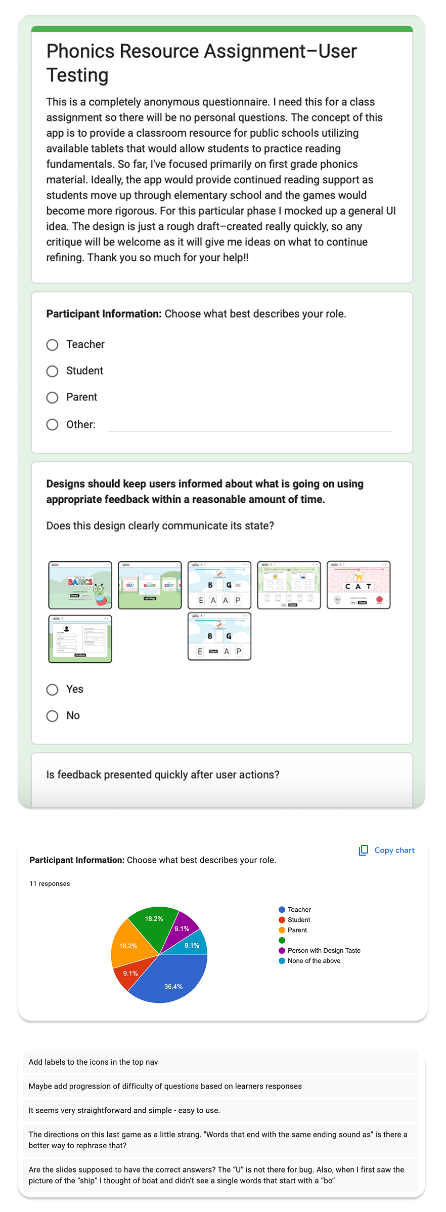
After gathering feedback, I addressed the identified issues in my final submission. I clarified the wording in the directions to avoid student confusion, added listening buttons for those who struggle with reading, removed the voice-recording feature to prevent privacy concerns, and used AI-generated images instead of relying on costly custom artwork.
One of the biggest challenges with this project was the delay in getting started. Due to limited communication with my professor, my topic wasn’t approved until three weeks into the course, which left me with just four weeks to complete everything—from research to prototyping. It was definitely a time crunch, especially while also teaching and working another job, but I’m proud of what I was able to pull off under pressure.
https://www.figma.com/proto/8INfuXDCSjO0Nantr5r9Wu/Capstone-Project?page-id=0%3A1&team_id=1247671696257051280&node-id=115-13180&starting-point-node-id=115%3A13102&t=HCgaqhZ6gPvxPdlI-1
A collection of early explorations in Figma—from my first hands-on projects during design bootcamps to a master's course assignment focused on accessibility. These projects were where I first started learning how to structure layouts, build components, and bring ideas to life through wireframes and prototypes. While each one served a different goal, they all reflect my learning curve, growing comfort with design tools, and curiosity about how good UX is built.
This was my very first experience with design—ever. As part of a four-week UI Foundations bootcamp, I was introduced to the basics of interface design and, for the first time, opened up Figma. The learning curve was steep, but I quickly found myself enjoying the process of exploring layout, hierarchy, and visual structure. Everything was new, and I was figuring it out as I went—but that made it all the more rewarding.
In our first mentorship session, we kicked things off by creating two different types of moodboards—focusing on two different aesthetics that we were inspired by. This was also my first time moodboarding, and even though I wasn’t quite sure what I was doing at first, I ended up having a lot of fun with it. It helped me start thinking about design more intentionally and gave me a visual foundation to work from in later stages.
In the following week, we used our moodboards as a jumping-off point to design a series of splash screens. The goal was to explore different visual directions and start narrowing down an aesthetic we’d carry through the rest of the project. It was a great way to experiment and start building confidence in my design choices.
Since this class was mainly focused on introducing Figma as a platform, the wireframes were provided for us—which helped take some pressure off while learning the basics. That said, we still had the freedom to move things around and make design decisions within the structure, which gave me space to explore and experiment.
The final prototype included five screens and some basic intro-level interactions using Figma’s prototyping tools. My design was heavily inspired by Spotify’s UI and the editorial-style moodboard I created earlier in the process. It was my first time seeing a concept come to life on screen, and it made everything click.
Like I mentioned before, this was my first experience with design—and by the end of it, I was hooked. Despite the steep learning curve, I picked things up quickly and really fell in love with the process. I was also lucky to have a supportive mentor and fellow students who gave thoughtful, constructive feedback that helped me grow with each step. Looking back, this project laid the foundation for everything that followed.
I know, I know—it’s the most overused app concept out there. But this project was a core part of the 24-week Product Design Academy bootcamp, and it followed me throughout the entire course. Unlike earlier assignments, this one dove deeper into the full design process: starting with research, then moving through wireframing, prototyping, and user testing. While the concept itself was familiar, it gave me a solid framework to practice end-to-end thinking and really apply what I was learning each week.
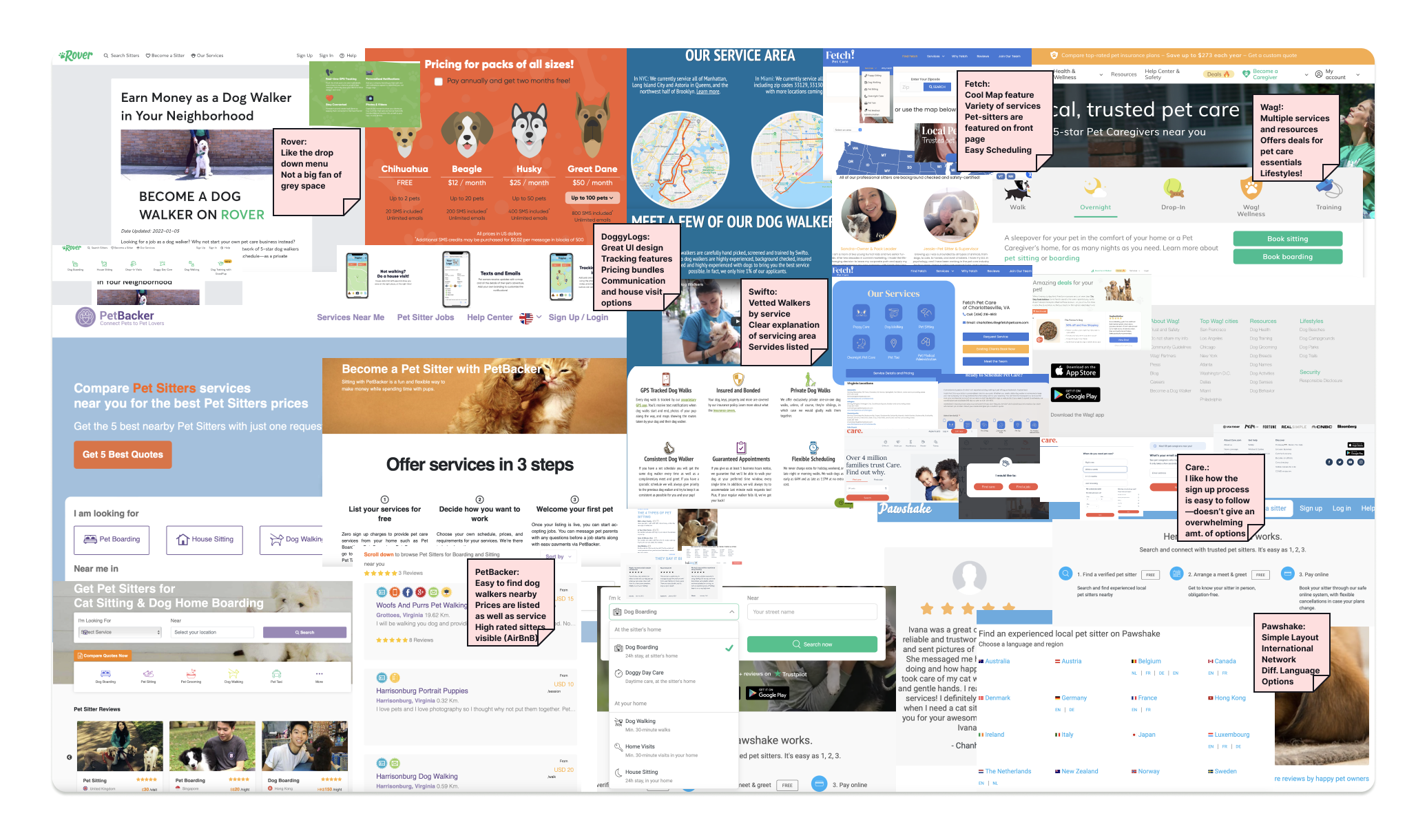
The first two weeks were all about getting grounded in UX/UI basics. We started by conducting a competitive analysis of existing dog-walking platforms—taking notes, identifying patterns, and debriefing as a group. It was a great way to spot what worked (and what didn’t) in the market, and it helped set the stage for our own design decisions moving forward.
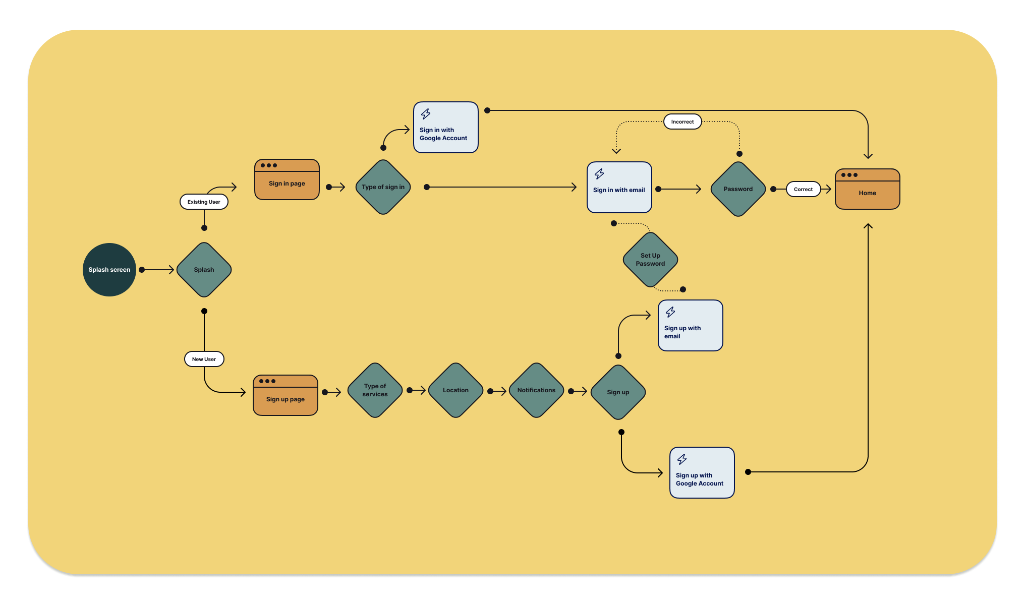
In the third week, we focused on mapping out the user flow, laying out how someone would move through the app from start to finish. We shared our drafts and gave each other constructive feedback through comments and guided questions, which really helped challenge assumptions and reduce personal bias. That collaborative process set a strong foundation and made the next phase—wireframing—much more intentional and user-focused.
Additionally, we spent time exploring different stylistic directions for the home screen to help narrow down our overall UI approach. It was a chance to experiment with color, layout, and hierarchy before locking in a visual direction for the rest of the app.
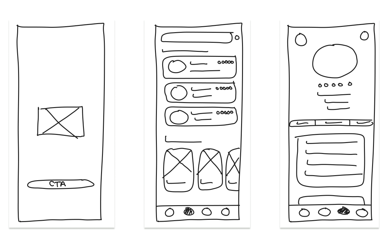
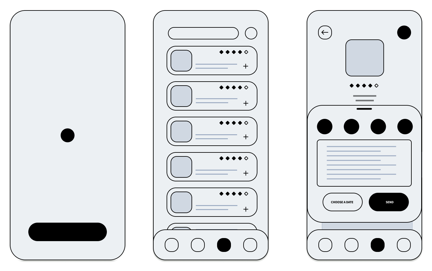
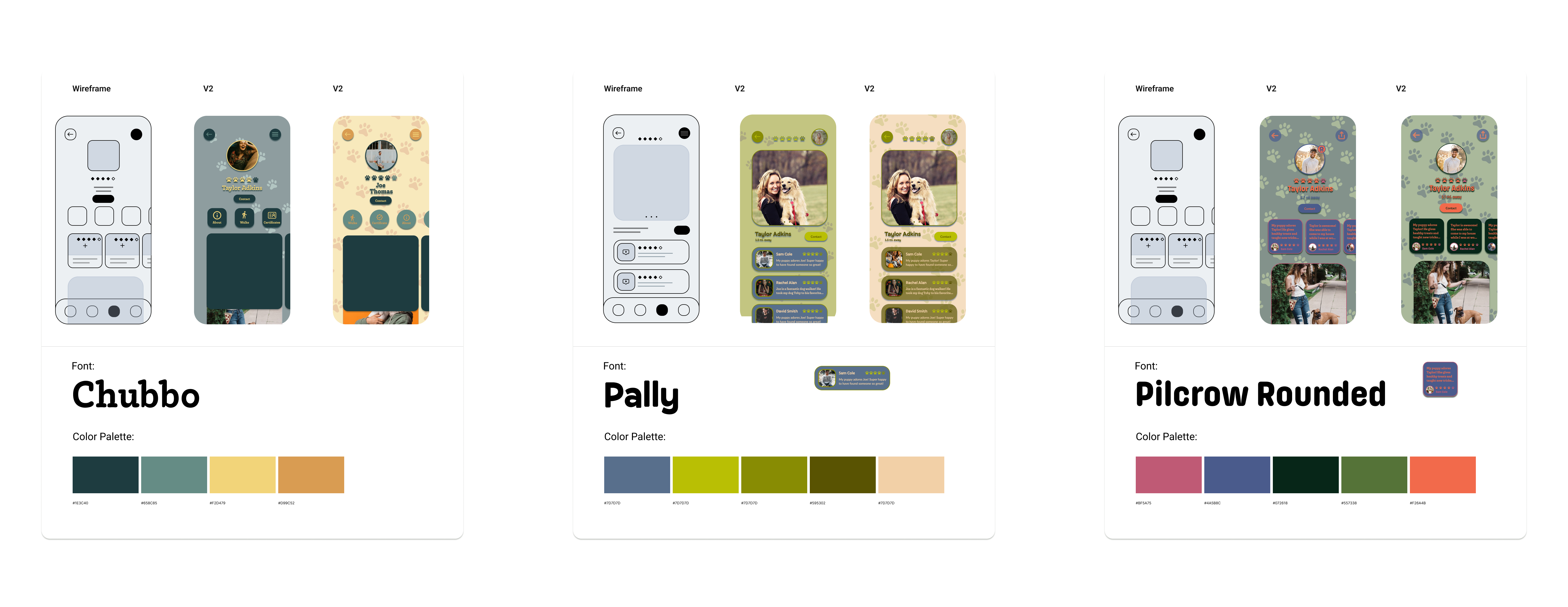
During the wireframing phase, we started with low-fidelity sketches to map out the app’s core structure and interactions. Once those were solid, we moved into high-fidelity wireframes, layering in more detail and visual hierarchy. After that, we finalized a style guide that would carry through the rest of the design, helping us stay consistent as we built out the full prototype. I chose a playful visual direction for the app, using rounded elements to complement my font choice. For the color palette, I pulled inspiration from nature and dog toys—aiming for something fun, approachable, and a little bit whimsical.
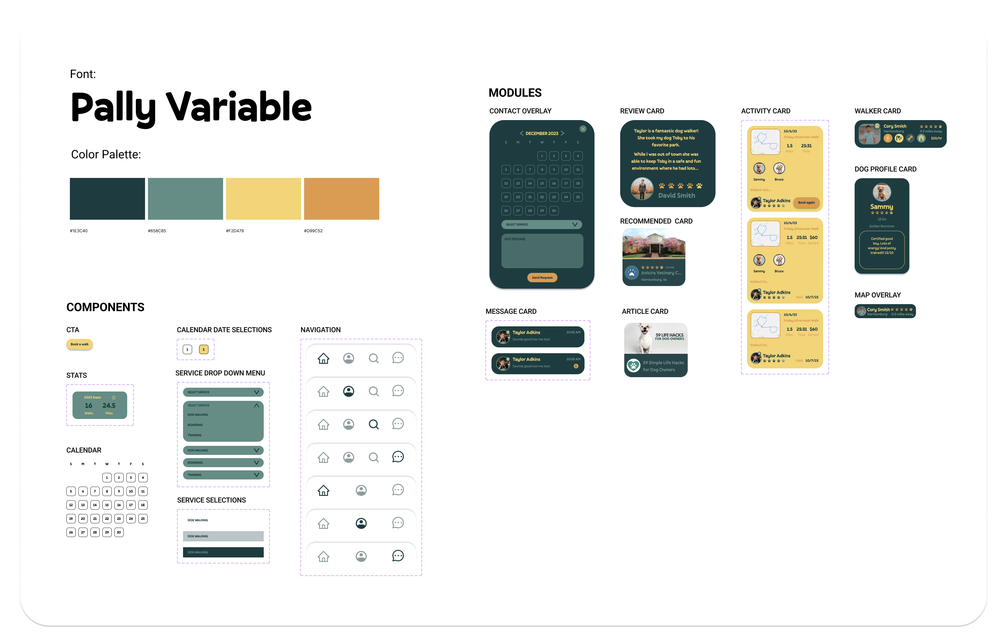
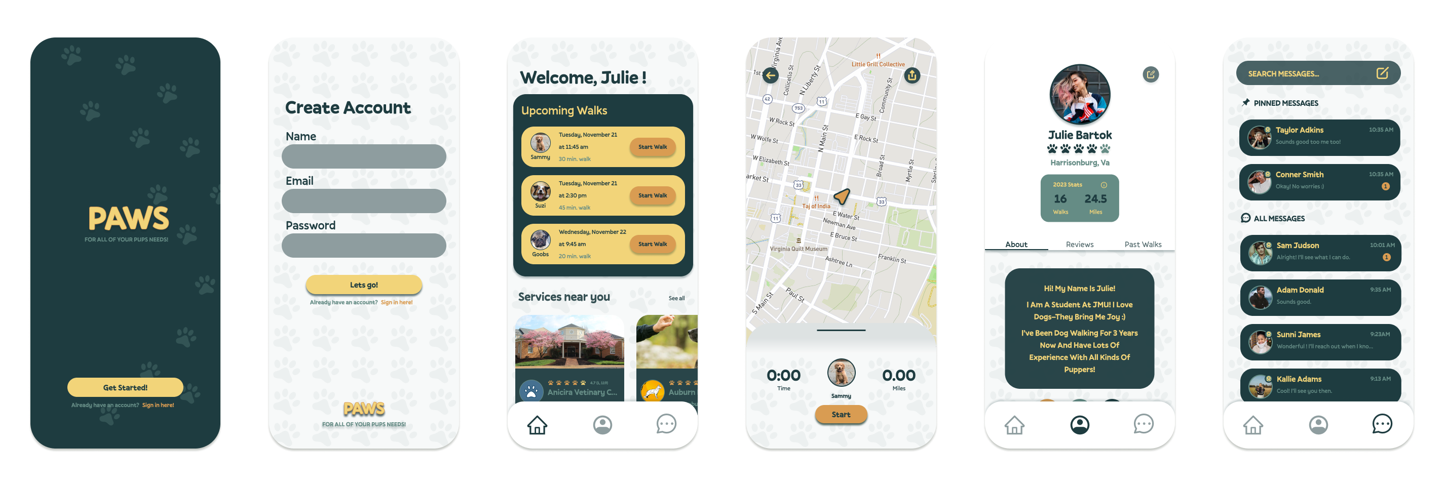
I was the only student in the course who chose to design a multi-user experience—one for dog owners and one for walkers—which meant extra work, but also more chances to stretch my skills. This project is where I realized how much I enjoy prototyping interactions and animations…I definitely got a little carried away, but I had a lot of fun. Looking back, there are a few stylistic choices I’d approach differently now, especially with a stronger understanding of accessibility, but overall I was really proud of how it turned out.
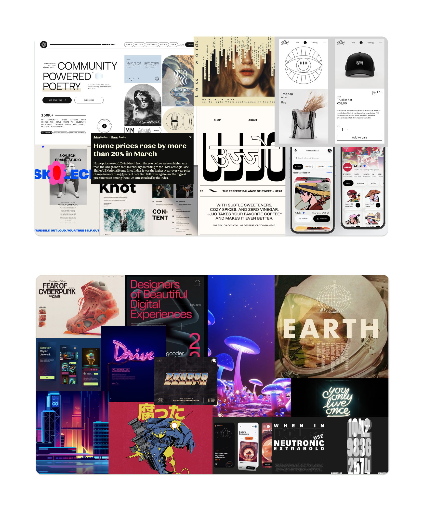
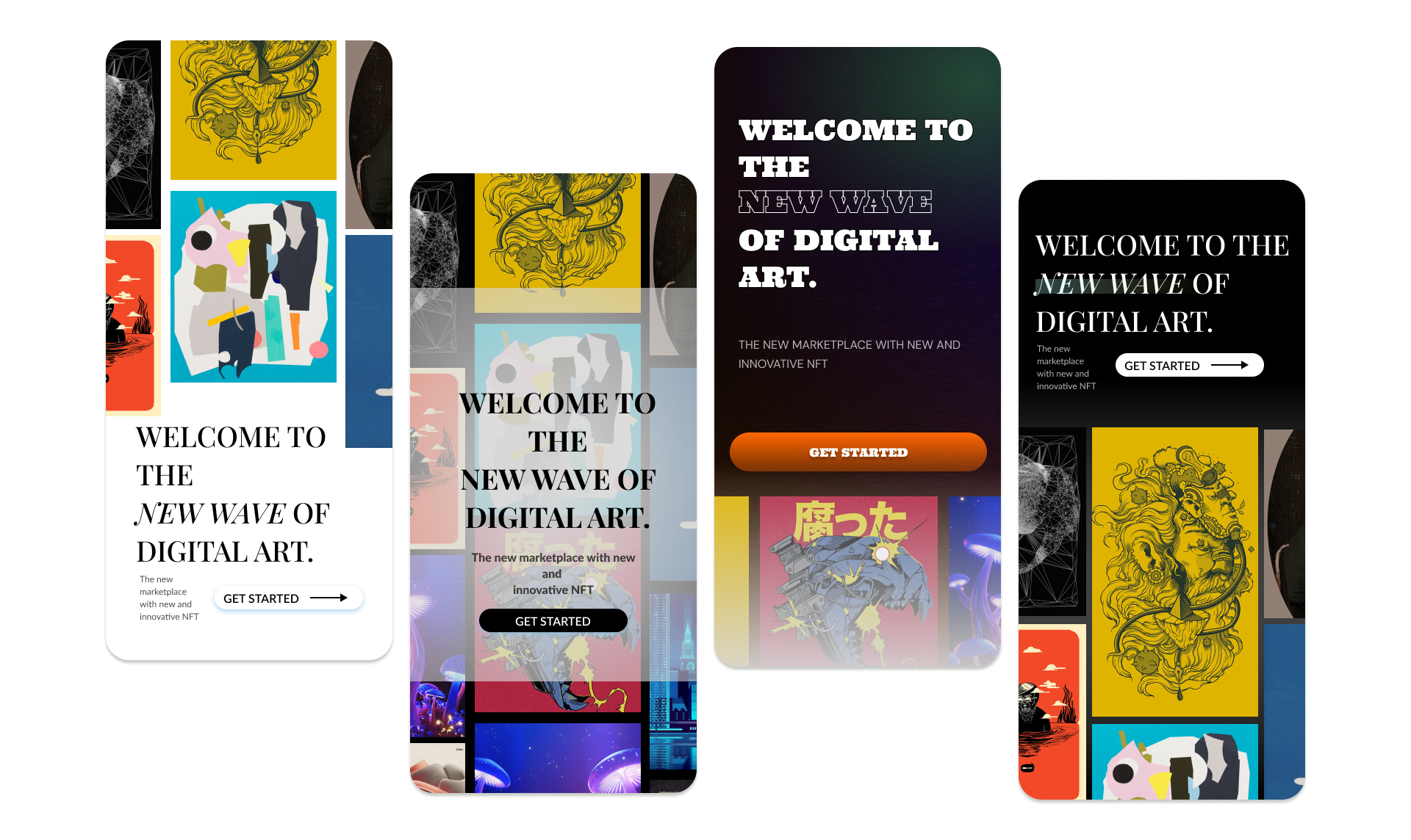
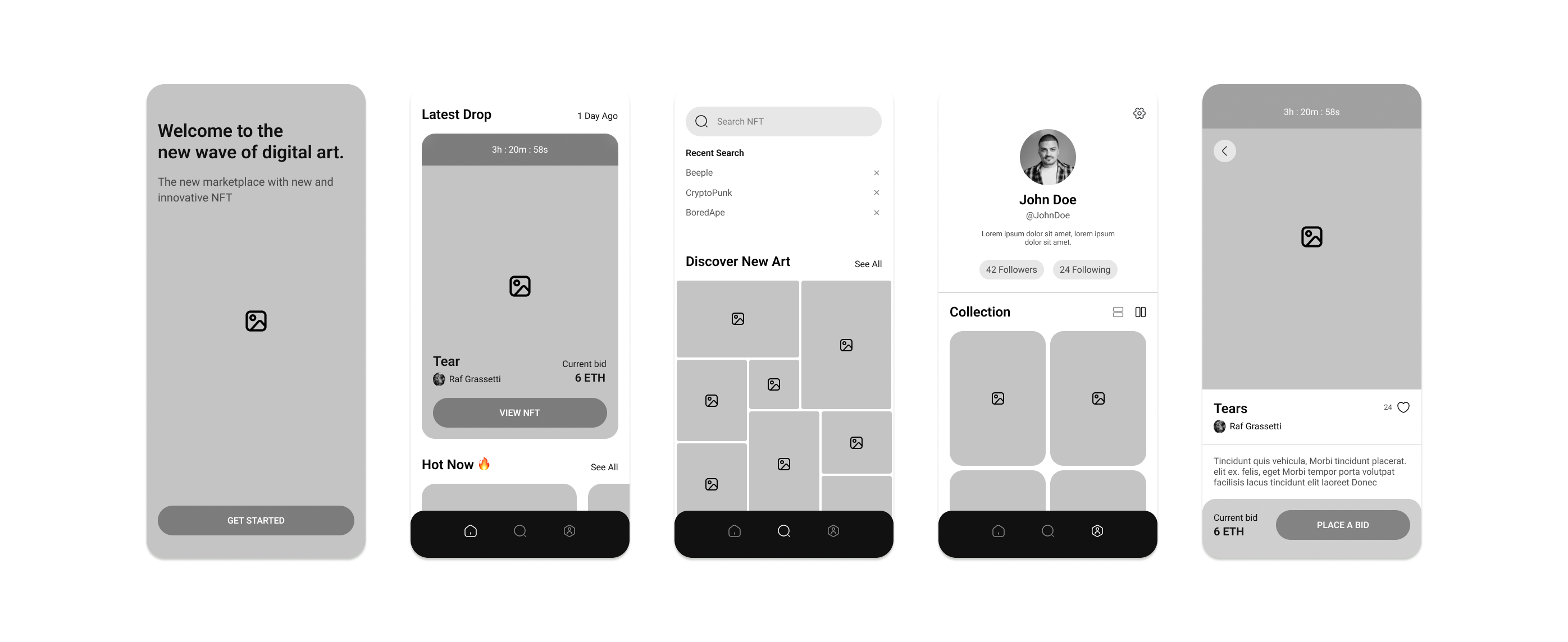
This project was just a small slice of a much larger challenge. As part of a master’s-level course, I was asked to choose an industry, observe its pain points, and design potential solutions. I focused on environmental sustainability and explored how design could help encourage more conscious decision-making in everyday life. The app concept I developed was just one part of a broader effort to understand and address the challenges within this space.
This project was just a small slice of a much larger challenge. As part of a master’s-level course, I was asked to choose an industry, observe its pain points, and design potential solutions. I focused on environmental sustainability and spent several weeks researching user behaviors, industry trends, and existing products. The app concept I developed was created during a three-day design sprint where I took the project from idea to interactive prototype—building out a fictional company, designing a logo, creating wireframes, developing a UI style guide, and assembling workable components. It was fast-paced but rewarding, and it gave me the chance to apply everything I’d researched into a focused, functional concept.
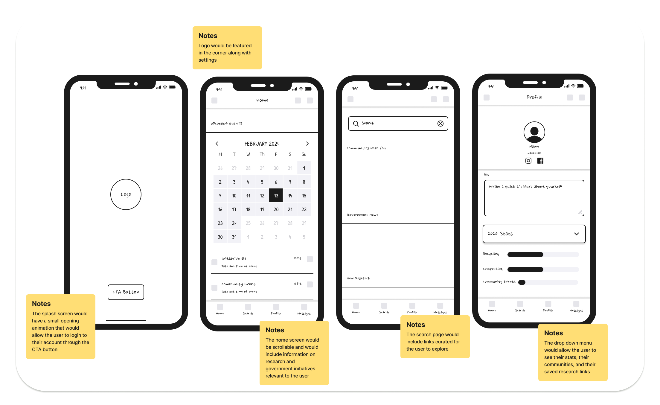
I developed the wireframes using a fun wireframing kit I found on Figma, which helped speed up the process and gave me a solid structure to build from. As I worked, I made notes on specific interactions I wanted to include—thinking through how users would navigate the app and where motion or feedback could make the experience feel more engaging and intuitive.
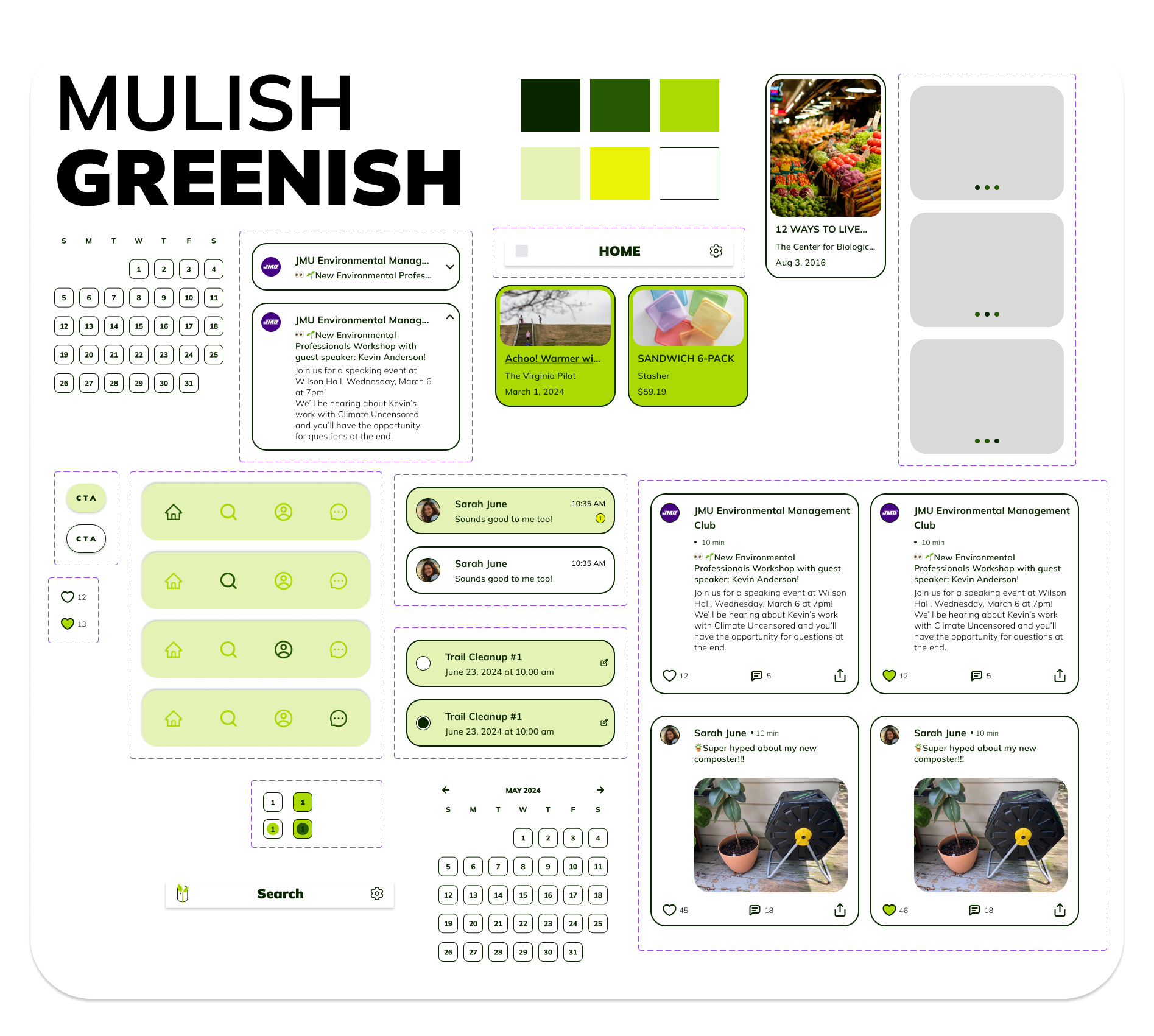
Next, I created a style guide that included complementary fonts and a thoughtful color palette. I wanted the UI to feel bright and fun, but still prioritize accessibility—making sure the typography was legible and avoiding visual clutter or distracting backgrounds. The goal was to strike a balance between playful and practical, so the experience felt engaging without overwhelming the user.
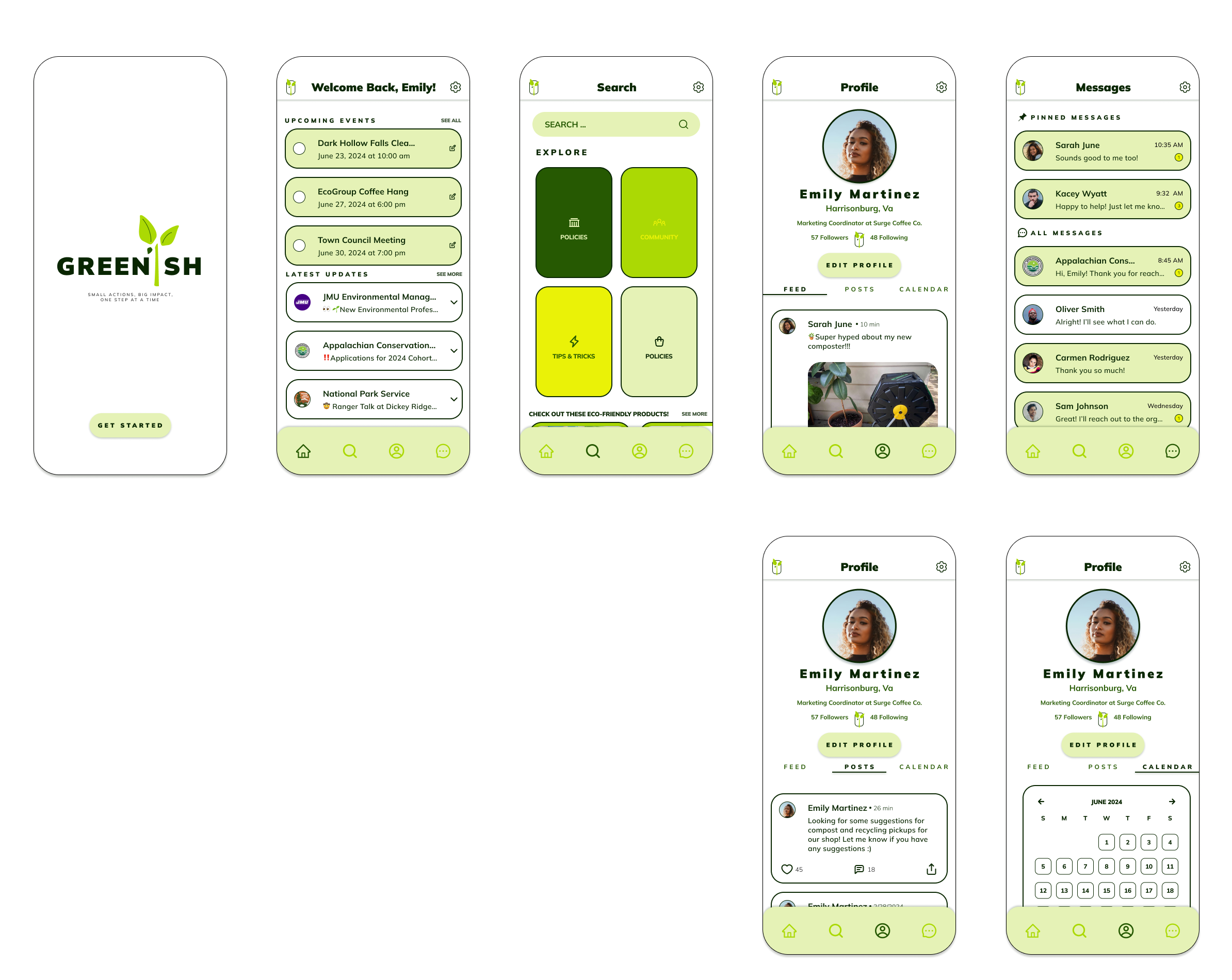
Because this was such a fast-paced project, the final concept ended up mirroring elements from my two earlier bootcamp projects—the ones that really sparked my interest in product design. In a way, it felt like a blend of the best parts of both: thoughtful structure, playful visuals, and interactive moments. Just like in my last project, I had a lot of fun prototyping interactions—especially the splash screen, where I built a simple (but fun) animation that added a little personality right out of the gate.
This project gave me the confidence to take a concept from start to finish—quickly and independently. Even with the tight timeline, it showed me how much I could accomplish when I stayed focused and trusted my process. Coincidentally, the next course I took was built around weekly design sprints, so this project ended up being the perfect foundation for what came next.

